Friday, April 27, 2012

A Touch of Wood in the Kitchen


I've got kitchens on the brain this week!

I'm very partial to painted kitchen cabinets, but I've always liked a little wood in there somewhere.  It just gives some warmth and depth....a little flavor, no matter what the style.  An island, a countertop, some open shelving, a section of cabinetry, ceiling beams, floor....please!  Something?

Imagine these fabulous kitchens without the touch of wood.

Patrick Printy - Elle Decor


Southern Living


House Beautiful


Nadia Caron and Karl Dalery - Canadian House and Home

Sara Steinfeld - Atlanta Homes and Lifestyles


Ruthie Sommers - House Beautiful


Shannon Bowers - House Beautiful


Ili Nilsson - Atlanta Homes and Lifestyles


Philip Mitchell - Canadian House and Home


Marshall Watson- House Beautiful


Stephen Knollenberg - Architectural Digest


Sharon Mimran - Canadian House and Home


Joan Schindler - House Beautiful


Trip Haenisch - Architectural Digest


Love that island above and
all the warmth that wood brings to each fabulous kitchen.


Wednesday, April 25, 2012

Traditional Kitchen Remodel - Before and After

This is one of my recently completed kitchen remodel projects where we took a heavy, masculine, dated look and lightened it up adding in more traditional mouldings and features to get exactly what the homeowner wanted. 


After

She wanted warm, creamy yellow tones and really fell in love with this granite.  We built the kitchen to reflect her desires and personality.


Before

The house had a sort of dated modern look with a chunky bullnose edge detail on everything and the stepped sheetrock detail at the ceiling that gave a very low, horizontal, racetrack look to the space.  The island was huge, really kind of encroaching on the adjacent small seating space, and had an odd angled shape with  a high bar.  High bars kind of divide the room I think and I'm not really a fan of unusually shaped islands.  I don't like things looking too contrived or forced.  And then there's that dark oak cabinetry and the 12" x 12" slate tile floor in this large space.

After

She did not want cabinets to the ceiling, but we did take the hood and a section of upper cabinets up to the ceiling to give height to the space.  We also moved the cooktop from the island to the wall as per the homeowner's preference. It gave the kitchen a new focus and added more interest than the plain run of cabinets shown below. The contrasting island brings some richness to the light space.


Before


After


The pool bath was given a facelift too...tumbled tile counters, a new mirror, fixtures, and paint.

After

I'll show the master bath remodel in another post.  This was such a great client to work with.  I just loved making their home reflect their personality and taste.


After photos by Miro Dvorscak

Linking to:


I would love it if you would become a follower of my blog!

Tuesday, April 24, 2012

Contrasting Kitchen Islands

Sometimes kitchens can look a little bland and boring all in one color or finish.  On some of my kitchen remodels I recommend making the island a contrasting finish so that it stands out as a piece of furniture or relieves some of the monotony of the cabinetry.  When I do that I often find I need to change the counter there too.  The kitchens then become sort of a two tone scheme, where there is a light counter on the dark cabinet and vice versa.  This design is not for every situation but it does work well in many instances.


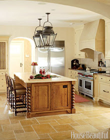
In the remodel above, the island really becomes the centerpiece of the kitchen with a beautiful wood finish and details like turned legs.  The counter is a textural limestone, coral reef, that brings more interest and brings everyone to the "table" of the kitchen.


A two tone scheme here was created, white counter on dark island and dark counter on white perimeter cabinets.


A new stained wood island becomes an added quality feature in this remodeled kitchen.  Again, light counter on darker island, dark counter on light perimeter cabinets. I'm doing a kitchen now where we have wood perimeter cabinets and a painted island.  Still contrasting, just the other way around.


You can see what I mean.  On both of these last two, we kept the existing floors for budget purposes. The floors were so light that going with the contrasting island really helps give some definition in the spaces.

The following designers also utilized a contrasting island to add interest and break up the space.

Jim Howard - House Beautiful


Suzanne Lantz - Traditional Home


Healing Barsanti - House Beautiful

 
Joan Nemirow - Traditional Home

M. Elle Design - Elle Decor


Christopher Peacock - House Beautiful


Dee Dee Taylor Eustace - Traditional Home


Nancy Bozhardt - House Beautiful


Stanley Hura - Traditional Home


Barry Dixon - House Beautiful

Ray Booth - Elle Decor


Loving some contrast in the kitchen!


Saturday, April 21, 2012

Working on Projects

Working this weekend on several projects.  I'm so busy running around all week, actual design time gets put off till the weekend!  That's okay....this is the fun part.

Gorgeous blue wallpaper choices for a feminine white tiled bathroom. 


LOVE these rug samples I received from The Rug Company rep who visited last week.  I'm so happy to be able to sell their beautiful products.


More gorgeous wallpaper for a girl's bathroom.  Love the white and some floral now too.  Doesn't that chunky white plaster sconce from Circa look perfect?

Have a great rest of the weekend, y'all! 


Friday, April 20, 2012

Cabinet Pulls - Where to Put Them?

I just scanned a quick sketch of a cabinet pull layout for a bathroom cabinet on a project.  If you think this is one detail you don't need to spec out on a job, you're wrong.

Not very professional looking I know, but it worked and it was fast!

This is my modern bathroom job and I like the pulls all mounted horizontally on the slab doors to work with the horizontal tile banding in the space.  We're doing an appliance pull in the center top dummy panel for a hand towel, something I did in my bathroom and I LOVE it.  It works so well.


I found some interesting projects where the way the cabinet pulls were mounted definitely impacted the design of the space and some of them really make a statement.  This last bit of a detail can be so
visually powerful.


Kay Douglass in HB

I love how utilitarian and oversized these are. The placement is so repetitious and purposeful to the design.  It highlights the simplicity of the space and the integrity of materials.


Eldon Wong in HB

The uniformity of placement really makes a statement here. 


Atlanta Homes and Lifestyles - Harrison Design Associates


Michael del Piero and Joseph Decker - House Beautiful


Jeff Lewis - 2010 Kitchen of the Year HB


Stephanie Stokes - House Beautiful

Love the brass and how those oversized pulls are centered in the doors.  The hardware is truly the feature here, placed front and center.


Thanks to houzz.com for two more project features, HERE and HERE!

Tuesday, April 17, 2012

Adding Traditional Details

Traditional design is very popular in this area.  People seem to love extra mouldings and details.  I'm always amazed when I see a real estate show on tv and if there's crown moulding anywhere, it seems someone will mention it with appreciation and awe, passing over many other more noticeable good qualities.  It's definitely an attention grabber.

I've had many clients who want to add detail and mouldings to their homes in the remodel process.  Adding just a few touches, sometimes makes all the difference in the world.


Paneling and brackets were added to the face of this bar for durability and an upgrade in materials.


Bar - Before


Bar - After


Block paneling with a curved foot detail was applied to an existing standard box cabinet before painting to give it the look of piece of furniture.


Upper and lower cabinets - Before


Hutch - After

Side panels on the upper cabinets that continued down as brackets were added to the existing cabinet and the crown was redone.  Paint covers up all the additional pieces and patching.  In this project, the pantry next to these cabinets was relocated in the space.  Upper door panels were cut out for seed glass inserts and cabinet pulls added, all helping to make these standard issue box cabinets look like a piece of furniture.


Brackets were added to the bottoms of these cabinets to help break up the space and give an unfitted look to the kitchen cabinetry.


Before

The cabinets read as one visual element in this large space.  The homeowner wanted a more traditional and interesting look in the kitchen without investing in a lot of new cabinets.


In this kitchen remodel, we added panels to the sides of the existing cabinetry.  It made for a more finished look.  See on the end of the cabinet by the sink?


Before

We did a new island and kept the cabinets on the left side of the kitchen.  Adding the side panels helped tie the old in with the new island.

Little moulding tricks (and lots of paint to cover them up) helped customize these projects for their homeowners.  At some point it is just better to rip it all out and start over, but for all these above, we saved money and kept cabinets out of the landfills!


If you're not a follower of my blog, I'd love it if you became one!


Linking to: